W3cubDocs
/Angular 2 TypeScriptAnimations
Motion is an important aspect in the design of modern web applications. Good user interfaces transition smoothly between states with engaging animations that call attention where it's needed. Well-designed animations can make a UI not only more fun but also easier to use.
Angular's animation system lets you build animations that run with the same kind of native performance found in pure CSS animations. You can also tightly integrate your animation logic with the rest of your application code, for ease of control.
Angular animations are built on top of the standard Web Animations API and run natively on browsers that support it.
For other browsers, a polyfill is required. Grab web-animations.min.js from GitHub and add it to your page.
Contents
- Example: Transitioning between two states.
- States and transitions.
- Example: Entering and leaving.
- Example: Entering and leaving from different states.
- Animatable properties and units.
- Automatic property calculation.
- Animation timing.
- Multi-step animations with keyframes.
- Parallel animation groups.
- Animation callbacks.
The examples in this page are available as a live example.
Quickstart example: Transitioning between two states

You can build a simple animation that transitions an element between two states driven by a model attribute.
Animations are defined inside @Component metadata. Before you can add animations, you need to import a few animation-specific functions:
hero-list-basic.component.ts
import {
  Component,
  Input,
  trigger,
  state,
  style,
  transition,
  animate
} from '@angular/core';
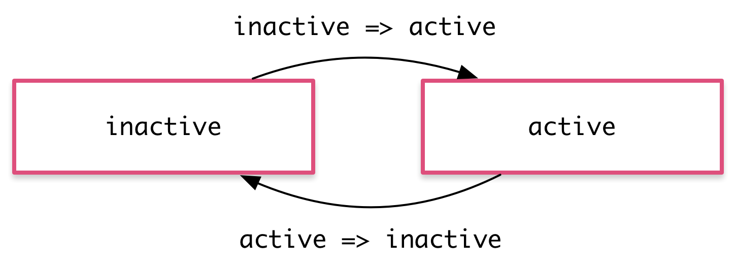
With these, you can define an animation trigger called heroState in the component metadata. It uses animations to transition between two states: active and inactive. When a hero is active, the element appears in a slightly larger size and lighter color.
hero-list-basic.component.ts (@Component excerpt)
  animations: [
    trigger('heroState', [
      state('inactive', style({
        backgroundColor: '#eee',
        transform: 'scale(1)'
      })),
      state('active',   style({
        backgroundColor: '#cfd8dc',
        transform: 'scale(1.1)'
      })),
      transition('inactive => active', animate('100ms ease-in')),
      transition('active => inactive', animate('100ms ease-out'))
    ])
  ]
In this example, you are defining animation styles (color and transform) inline in the animation metadata.
Now, using the [@triggerName] syntax, attach the animation that you just defined to one or more elements in the component's template.
hero-list-basic.component.ts (excerpt)
template: `
  <ul>
    <li *ngFor="let hero of heroes"
        [@heroState]="hero.state"
        (click)="hero.toggleState()">
      {{hero.name}}
    </li>
  </ul>
`,
Here, the animation trigger applies to every element repeated by an ngFor. Each of the repeated elements animates independently. The value of the attribute is bound to the expression hero.state and is always either active or inactive.
With this setup, an animated transition appears whenever a hero object changes state. Here's the full component implementation:
hero-list-basic.component.ts
import {
  Component,
  Input,
  trigger,
  state,
  style,
  transition,
  animate
} from '@angular/core';

import { Heroes } from './hero.service';

@Component({
  selector: 'hero-list-basic',
  template: `
    <ul>
      <li *ngFor="let hero of heroes"
          [@heroState]="hero.state"
          (click)="hero.toggleState()">
        {{hero.name}}
      </li>
    </ul>
  `,
  styleUrls: ['./hero-list.component.css'],
  animations: [
    trigger('heroState', [
      state('inactive', style({
        backgroundColor: '#eee',
        transform: 'scale(1)'
      })),
      state('active',   style({
        backgroundColor: '#cfd8dc',
        transform: 'scale(1.1)'
      })),
      transition('inactive => active', animate('100ms ease-in')),
      transition('active => inactive', animate('100ms ease-out'))
    ])
  ]
})
export class HeroListBasicComponent {
  @Input() heroes: Heroes;
}
States and transitions
Angular animations are defined as logical states and transitions between states.
An animation state is a string value that you define in your application code. In the example above, the states 'active' and 'inactive' are based on the logical state of hero objects. The source of the state can be a simple object attribute, as it was in this case, or it can be a value computed in a method. The important thing is that you can read it into the component's template.
You can define styles for each animation state:
state('inactive', style({
  backgroundColor: '#eee',
  transform: 'scale(1)'
})),
state('active',   style({
  backgroundColor: '#cfd8dc',
  transform: 'scale(1.1)'
})),
These state definitions specify the end styles of each state. They are applied to the element once it has transitioned to that state, and stay as long as it remains in that state. In effect, you're defining what styles the element has in different states.
After you define states, you can define transitions between the states. Each transition controls the timing of switching between one set of styles and the next:
transition('inactive => active', animate('100ms ease-in')),
transition('active => inactive', animate('100ms ease-out'))

If several transitions have the same timing configuration, you can combine them into the same transition definition:
transition('inactive => active, active => inactive',
 animate('100ms ease-out'))
When both directions of a transition have the same timing, as in the previous example, you can use the shorthand syntax <=>:
transition('inactive <=> active', animate('100ms ease-out'))
You can also apply a style during an animation but not keep it around after the animation finishes. You can define such styles inline, in the transition. In this example, the element receives one set of styles immediately and is then animated to the next. When the transition finishes, none of these styles are kept because they're not defined in a state.
transition('inactive => active', [
  style({
    backgroundColor: '#cfd8dc',
    transform: 'scale(1.3)'
  }),
  animate('80ms ease-in', style({
    backgroundColor: '#eee',
    transform: 'scale(1)'
  }))
]),
The wildcard state *
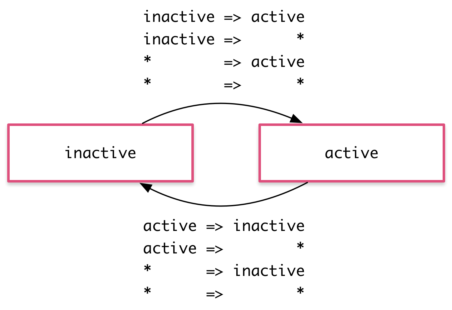
The * ("wildcard") state matches any animation state. This is useful for defining styles and transitions that apply regardless of which state the animation is in. For example:
- The
active => *transition applies when the element's state changes fromactiveto anything else. - The
* => *transition applies when any change between two states takes place.

The void state
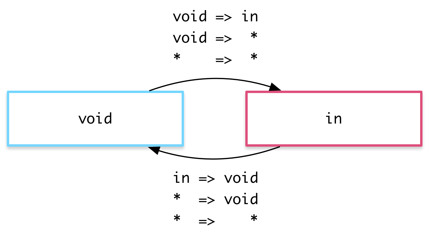
The special state called void can apply to any animation. It applies when the element is not attached to a view, perhaps because it has not yet been added or because it has been removed. The void state is useful for defining enter and leave animations.
For example the * => void transition applies when the element leaves the view, regardless of what state it was in before it left.

The wildcard state * also matches void.
Example: Entering and leaving

Using the void and * states you can define transitions that animate the entering and leaving of elements:
- Enter:
void => * - Leave:
* => void
For example, in the animations array below there are two transitions that use the void => * and * => void syntax to animate the element in and out of the view.
hero-list-enter-leave.component.ts (excerpt)
animations: [
  trigger('flyInOut', [
    state('in', style({transform: 'translateX(0)'})),
    transition('void => *', [
      style({transform: 'translateX(-100%)'}),
      animate(100)
    ]),
    transition('* => void', [
      animate(100, style({transform: 'translateX(100%)'}))
    ])
  ])
]
Note that in this case the styles are applied to the void state directly in the transition definitions, and not in a separate state(void) definition. Thus, the transforms are different on enter and leave: the element enters from the left and leaves to the right.
These two common animations have their own aliases:
transition(':enter', [ ... ]); // void => *
transition(':leave', [ ... ]); // * => void
Example: Entering and leaving from different states

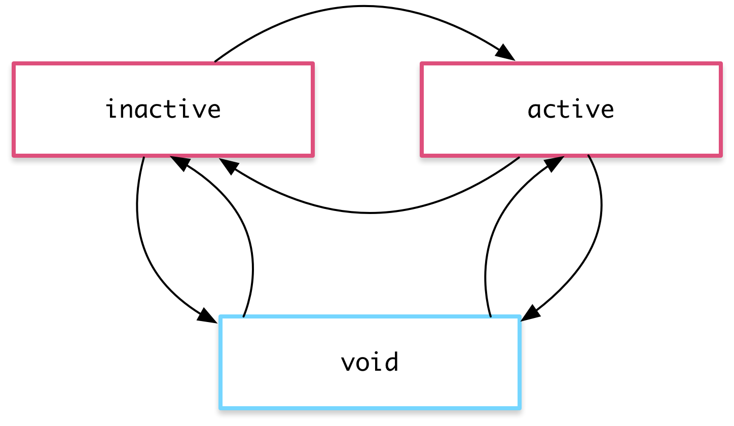
You can also combine this animation with the earlier state transition animation by using the hero state as the animation state. This lets you configure different transitions for entering and leaving based on what the state of the hero is:
- Inactive hero enter:
void => inactive - Active hero enter:
void => active - Inactive hero leave:
inactive => void - Active hero leave:
active => void
This gives you fine-grained control over each transition:

hero-list-enter-leave.component.ts (excerpt)
animations: [
  trigger('heroState', [
    state('inactive', style({transform: 'translateX(0) scale(1)'})),
    state('active',   style({transform: 'translateX(0) scale(1.1)'})),
    transition('inactive => active', animate('100ms ease-in')),
    transition('active => inactive', animate('100ms ease-out')),
    transition('void => inactive', [
      style({transform: 'translateX(-100%) scale(1)'}),
      animate(100)
    ]),
    transition('inactive => void', [
      animate(100, style({transform: 'translateX(100%) scale(1)'}))
    ]),
    transition('void => active', [
      style({transform: 'translateX(0) scale(0)'}),
      animate(200)
    ]),
    transition('active => void', [
      animate(200, style({transform: 'translateX(0) scale(0)'}))
    ])
  ])
]
Animatable properties and units
Since Angular's animation support builds on top of Web Animations, you can animate any property that the browser considers animatable. This includes positions, sizes, transforms, colors, borders, and many others. The W3C maintains a list of animatable properties on its CSS Transitions page.
For positional properties that have a numeric value, you can define a unit by providing the value as a string with the appropriate suffix:
'50px''3em''100%'
If you don't provide a unit when specifying dimension, Angular assumes the default of px:
-
50is the same as saying'50px'
Automatic property calculation

Sometimes you don't know the value of a dimensional style property until runtime. For example, elements often have widths and heights that depend on their content and the screen size. These properties are often tricky to animate with CSS.
In these cases, you can use a special * property value so that the value of the property is computed at runtime and then plugged into the animation.
In this example, the leave animation takes whatever height the element has before it leaves and animates from that height to zero:
animations: [
  trigger('shrinkOut', [
    state('in', style({height: '*'})),
    transition('* => void', [
      style({height: '*'}),
      animate(250, style({height: 0}))
    ])
  ])
]
Animation timing
There are three timing properties you can tune for every animated transition: the duration, the delay, and the easing function. They are all combined into a single transition timing string.
Duration
The duration controls how long the animation takes to run from start to finish. You can define a duration in three ways:
- As a plain number, in milliseconds:
100 - In a string, as milliseconds:
'100ms' - In a string, as seconds:
'0.1s'
Delay
The delay controls the length of time between the animation trigger and the beginning of the transition. You can define one by adding it to the same string following the duration. It also has the same format options as the duration:
- Wait for 100ms and then run for 200ms:
'0.2s 100ms'
Easing
The easing function controls how the animation accelerates and decelerates during its runtime. For example, an ease-in function causes the animation to begin relatively slowly but pick up speed as it progresses. You can control the easing by adding it as a third value in the string after the duration and the delay (or as the second value when there is no delay):
- Wait for 100ms and then run for 200ms, with easing:
'0.2s 100ms ease-out' - Run for 200ms, with easing:
'0.2s ease-in-out'

Example
Here are a couple of custom timings in action. Both enter and leave last for 200 milliseconds, that is 0.2s, but they have different easings. The leave begins after a slight delay of 10 milliseconds as specified in '0.2s 10 ease-out':
hero-list-timings.component.ts (excerpt)
animations: [
  trigger('flyInOut', [
    state('in', style({opacity: 1, transform: 'translateX(0)'})),
    transition('void => *', [
      style({
        opacity: 0,
        transform: 'translateX(-100%)'
      }),
      animate('0.2s ease-in')
    ]),
    transition('* => void', [
      animate('0.2s 10 ease-out', style({
        opacity: 0,
        transform: 'translateX(100%)'
      }))
    ])
  ])
]
Multi-step animations with keyframes

Animation keyframes go beyond a simple transition to a more intricate animation that goes through one or more intermediate styles when transitioning between two sets of styles.
For each keyframe, you specify an offset that defines at which point in the animation that keyframe applies. The offset is a number between zero, which marks the beginning of the animation, and one, which marks the end.
This example adds some "bounce" to the enter and leave animations with keyframes:
hero-list-multistep.component.ts (excerpt)
animations: [
  trigger('flyInOut', [
    state('in', style({transform: 'translateX(0)'})),
    transition('void => *', [
      animate(300, keyframes([
        style({opacity: 0, transform: 'translateX(-100%)', offset: 0}),
        style({opacity: 1, transform: 'translateX(15px)',  offset: 0.3}),
        style({opacity: 1, transform: 'translateX(0)',     offset: 1.0})
      ]))
    ]),
    transition('* => void', [
      animate(300, keyframes([
        style({opacity: 1, transform: 'translateX(0)',     offset: 0}),
        style({opacity: 1, transform: 'translateX(-15px)', offset: 0.7}),
        style({opacity: 0, transform: 'translateX(100%)',  offset: 1.0})
      ]))
    ])
  ])
]
Note that the offsets are not defined in terms of absolute time. They are relative measures from zero to one. The final timeline of the animation is based on the combination of keyframe offsets, duration, delay, and easing.
Defining offsets for keyframes is optional. If you omit them, offsets with even spacing are automatically assigned. For example, three keyframes without predefined offsets receive offsets 0, 0.5, and 1.
Parallel animation groups

You've seen how to animate multiple style properties at the same time: just put all of them into the same style() definition.
But you may also want to configure different timings for animations that happen in parallel. For example, you may want to animate two CSS properties but use a different easing function for each one.
For this you can use animation groups. In this example, using groups both on enter and leave allows for two different timing configurations. Both are applied to the same element in parallel, but run independently of each other:
hero-list-groups.component.ts (excerpt)
animations: [
  trigger('flyInOut', [
    state('in', style({width: 120, transform: 'translateX(0)', opacity: 1})),
    transition('void => *', [
      style({width: 10, transform: 'translateX(50px)', opacity: 0}),
      group([
        animate('0.3s 0.1s ease', style({
          transform: 'translateX(0)',
          width: 120
        })),
        animate('0.3s ease', style({
          opacity: 1
        }))
      ])
    ]),
    transition('* => void', [
      group([
        animate('0.3s ease', style({
          transform: 'translateX(50px)',
          width: 10
        })),
        animate('0.3s 0.2s ease', style({
          opacity: 0
        }))
      ])
    ])
  ])
]
One group animates the element transform and width; the other group animates the opacity.
Animation callbacks
A callback is fired when an animation is started and also when it is done.
In the keyframes example, you have a trigger called @flyInOut. You can hook those callbacks like this:
hero-list-multistep.component.ts (excerpt)
template: `
  <ul>
    <li *ngFor="let hero of heroes"
        (@flyInOut.start)="animationStarted($event)"
        (@flyInOut.done)="animationDone($event)"
        [@flyInOut]="'in'">
      {{hero.name}}
    </li>
  </ul>
`,
The callbacks receive an AnimationTransitionEvent which contains useful properties such as fromState, toState and totalTime.
Those callbacks will fire whether or not an animation is picked up.
© 2010–2017 Google, Inc.
Licensed under the Creative Commons Attribution License 4.0.
https://v2.angular.io/docs/ts/latest/guide/animations.html